There are four key areas that help define print from web or screen projects. They are: 1) resolution, 2) color, 3) size/measurement and 4) file format.
If you’re ever forced to begin a project before you know what it’s being used for (sounds ridiculous doesn’t it, I know, but this actually happens in the real world!), then I would err on the side of caution and create it for print. Why? Because it is easier to reduce the number of pixels than to invent, or interpolate, new ones. So, let’s zoom in on the first—and most important factor—when designing for print or web graphics: resolution.
resolution
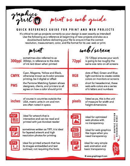
Resolution refers to the number of pixels in your raster image, such as a photo. High resolution means there are 300 (or more) pixels per inch, or ppi, in your image. If you want to use your image in something that gets printed, such as a brochure or flyer, then it must be at least 300ppi.
BTW: sometimes you’ll hear printers or designers refer to this as 300dpi. I catch myself even saying this because I do a lot of packaging design and anyway, heck, even Adobe, states DPI. But technically DPI refers to the dots of ink that print, not the pixels in the image itself. (But it does only follow that in order for them to print, they must first exist though, right? So, I wouldn’t get bent out of shape over PPI vs DPI.) Just know that your image’s resolution must be 300 or it will be blurry when you print it!
The resolution for design that’s only seen on screens, such as websites, banners, or presentations on computers, pads, kiosks and phones is 72ppi.
FYI: as more devices are being produced with high-resolution retina displays, a PPI between 72 and 120 ensures your work is going to be roughly the same size ratio everywhere. PCs actually happen to have a default PPI of 96 and macs have a PPI of a minimum of 72 up to around maximum of 120. However, the general standard for acceptable quality images is 72 PPI.
color
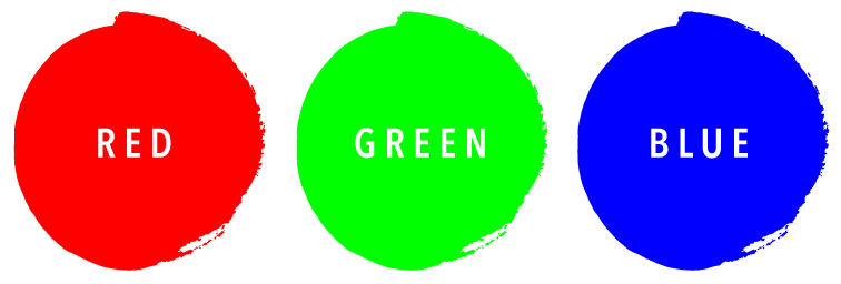
Color for screen projects is created in RGB. This comes from the dots of Red, Green and Blue light that combine to create visible colors on monitors or screens.
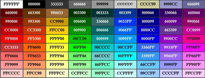
Color for websites is noted in the code as hexadecimal values of 6 letters and numbers such as #00000 for black, #FFFFFF for white, or any color imaginable—even beyond the 256 known web-safe color such as dark blue: #333399 which appear the same across all platforms. (Of course you can use any color for websites, not just these 256; they just may vary slightly from monitor to monitor.)

Color for print projects can be either in CMYK: Cyan, Magenta, Yellow and Black, otherwise known as 4-color process, be it for digital or offset printing.
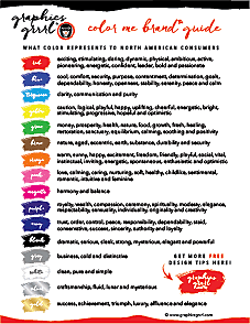
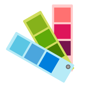 Or you can also add spot, or PMS (Pantone Matching System), colors instead of or in addition to these four. PMS colors allow designers, clients and printers to all agree on how a color should print. They are often used in logos where the color is part of the brand, so its consistency across all mediums and printing types helps mark the product (Ex: Coca-Cola red). For more information on how color affects brand perception, read my article here.
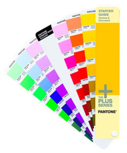
BTW: the full Pantone set can cost thousands, but I found this very affordable PMS fan that will prove helpful and is all that most people need when they’re first starting out:

measurement
In an ideal world, you know the dimensions of the project for which you are designing. Unfortunately, we live in the real world and things change, so all you can do is ask for the specs and final size of your brochure, flyer, etc. upfront. Whatever they are (or change to) for print, they will almost always be in inches.
Now, of course, the rest of the world is on the metric system, so please know that dimensions can also be provided in centimeters or millimeters. If this is ever the case, you can easily set up your file in any Adobe graphics program to have that unit of measurement.
You can set these dimensions and the unit of measurement when you first create a new document or you can change them once you’ve started. (Obviously, you may need to also modify elements in your design if you change the width and height dimensions, so for this reason, it’s always easier to get confirmation before you begin!)
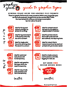
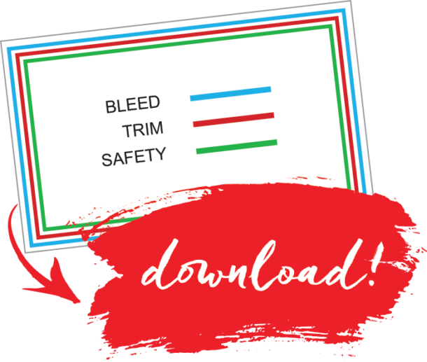
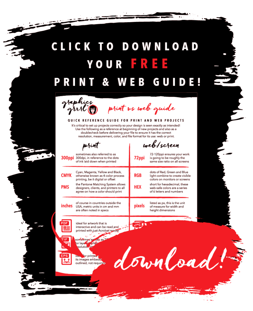
And grab this FREE handy dandy quick print & web graphics guide for easy reference!
Download it here for FREE:
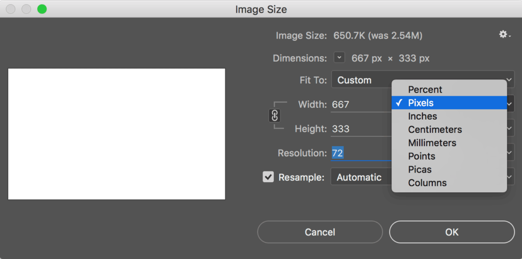
For web or work seen on screens and monitors, the unit of measurement should be in pixels. That’s because pixels are how screen resolution is generated. As discussed under resolution, many monitors have a high resolution retina display which exceeds 72ppi (pixels per inch), but using the minimum of 72ppi will allow your graphics to be relatively the same size across different monitors.
To change the unit of measure in Photoshop, go to Image/Image Size and change it there for one image:
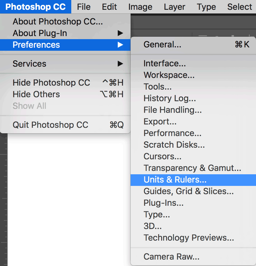
Or globally change the unit of measure for the application under Preferences:





 Or you can also add spot, or PMS (Pantone Matching System), colors instead of or in addition to these four. PMS colors allow designers, clients and printers to all agree on how a color should print. They are often used in logos where the color is part of the brand, so its consistency across all mediums and printing types helps mark the product (Ex: Coca-Cola red). For more information on how color affects brand perception, read my article