Below are 10 more examples of brands that utilize subliminal messaging. Quick: how many can you decipher? The Bronx Zoo’s logo featuring birds and two giraffes pays homage to the zoo’s home city. New York’s iconic skyline of tall buildings can be found between the legs of the giraffes.
This logo of Beats, a producer of audio equipment by Dr. Dre, represents not only a B for the brand’s namesake, it represents someone wearing headphones. The red color in the Beats logo represents passion, energy, intimacy and excitement, and the black color depicts power and prestige. For more information on how color affects brand perception, be sure to read this article.

Gillette, the razor company, has a razor sharp logo–literally! The slice from the i to the G looks as if it’s been carefully cut with a sharp razor.
The London Symphony Orchestra logo not only looks like an abstract conductor, it’s actually an acronym. The script is a bit hard to read, but do you see the L, S and O now?

Even though this channel’s logo has seen many iterations over the years, the white space in the NBC logo creates a peacock with colorful plumage, representing the introduction of color televisions (when it was originally designed) and today is symbolic for being proud (‘as a peacock’) of its broadcasting. Did you know that the six different colors of the feathers represent the six different divisions of NBC?
The social platform, Pinterest, allows users to pin images they find onto boards, so it makes sense that there’s a pushpin hidden in the P.

When you first look at Hope for African Children Initiative’s logo, you see the map of Africa. If you look more closely, you can see that the map’s outline is actually created by the contours of two people–an adult in the upper right corner and a child in the lower left.
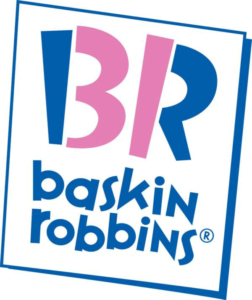
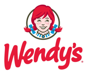 And of course you see the number 31 in Baskin Robbin’s logo:

 The Bronx Zoo’s logo featuring birds and two giraffes pays homage to the zoo’s home city. New York’s iconic skyline of tall buildings can be found between the legs of the giraffes.


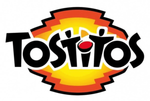 The two middle Ts in Tostitos are two people at a table (the letter I) dipping a tortilla chip into the dot of the I which is a bowl of salsa.
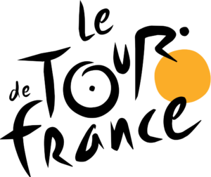 A cyclist is formed from the R and the sun in the Tour de France logo serves as a bike wheel.
 Last but not least, my favorite: the Amazon logo. The arrow doubles as a satisfied smile (with a dimple!) and points from A to Z, simply meaning they sell everything from a to z.